My Portfolio Review

by Joe Singleton

The DC Comics Portfolio Review

When you're an aspiring comic artist, there's very little as hard as sitting still while someone you don't know, who doesn't know you, looks at your work for the first time and starts picking it apart. Sure, you know going in that it's nothing personal, but it's still not easy to hear.

My main purpose for going to the San Diego con, was to show my work around to various publishers and try to come up with some work. First on my list, because they ran a special orientation session each morning, was DC Comics. I missed my shot on Thursday, you snooze, you lose, they say, but I made it, on Friday.

The way DC worked it, they let a hundred people into the room, gave us the rundown and passed out numbered raffle tickets. Then they pulled sixty numbers out of a bag and each of those got an orange pass, which specified a time for a review.

Richard Bruning handled the orientation session. He was straightforward, sympathetic and pleasant, but he also warned of things _not_ to expect, at the portfolio review. He explained the various roles that a penciler plays in the production of a comic, using examples I have used, myself. A penciler has, in movie terms, many jobs. He must be the set and costume designer, casting director, the camera man, the director, the cinematographer, the special FX team, and all the actors, among others. Bruning says that drawing comics is the hardest job in the business. He probably doesn't ingratiate himself with many writers, by saying this. He also tells us not to expect a job out of this review, they only want to see what we can do, and they won't be taking any sample packages.

We were told to expect criticism pointing out our weaknesses, the things that need improvement. They will also point out where we're doing things right. Don't expect to be babied, they wouldn't be doing you any favor, if they weren't honest. Thick skin, that's the key to surviving criticism.

When they hand out the tickets, my legs are shaking. I don't know if it's the excitement or just low blood sugar. Mine is number 660. This is when my inner pessimist takes over and I just know I'm not going to get selected, today. But, the gambler in me, knows the odds are in my favor. Finally the guy say, "six-sixty", and my heart can slow down, a bit.

I almost trip over my own feet, getting up to get my appointment slip. The bright orange half-sheet of paper says:

Congratulations!
You have completed the DC Comics Portfolio Review Orientation.
Use this pass to have your portfolio reviewed at the DC Comics Booth.

My appointment was for Friday at 2:00 PM

So, I've got a few hours to kill, before my review. Time for food.

With two o'clock fast approaching, I make my way over to the DC Comics "Booth". As booths go, it's fairly large, something like a 30 X 30 foot square. The portfolio reviews are being handled at these odd, pentagonal tables (roughly the same shape as the outline of Superman's "S" shield), on opposite sides of the booth. There are a few people ahead of me, when I arrive, so I stand back and try to catch what's being said to them.

There is one guy, ahead of me, who will one day be a name in the industry, if I have any eye for talent. He has some Aquaman pages and his style complements the material, the only weaknesses are in the finish of a few figures and some of his layouts. For instance, on two consecutive pages, he has Aquaman in virtually the same pose, the same size, which the reviewer points out. It doesn't pay to become "married" to a particular pose. You need to flex your artistic muscles with different angles and poses.

The reviewer, an editor for DC's Vertigo line tells him to send some samples to various editors, at least every three months. Something to keep in mind.

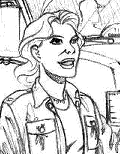
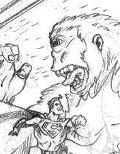
When I sit down with the reviewer, his name is George, (I couldn't see his badge, so I didn't get a last name) I pull out the pages I had done specifically for this con. It's a five page story, starring Superboy and Wonder Girl, on an out-of-costume day off. I wanted to do something different from what everyone else at the con would be showing.

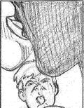
Overall, the review went pretty well, but there were a few points that need work. Mainly, the faces are not consistent from page to page. On page two, the big "action scene" could be from a more dramatic angle, something I should have seen, myself. On lower half ofthe third page, a lot of elements from different panels tend to "line up", which has an unintended unifying effect. This is fine, if the scenes are all supposed to be tied together by some elements, but can be jarring to the eye, when it's not. The children could be more convincing, too.

On a positive note, he liked my use of different camera angles and distances. The flow of the pages, he said, was excellent and the storytelling worked.

As with any good critic, he was honest and encouraging, and gave tips on how to improve the work. For the character faces, he suggests model sheets. A model sheet is a page of the faces from various angles, so that you work out all the problems, in advance. The same can work for the full figures, buildings, cars, etc.

I'm going to work on these pages, again, and submit them by mail to DC editors.

The Marvel Comics Portfolio Review

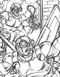
Marvel Comics currently has a talent search going on. For the San Diego con, there was a four page Thor plot posted on Marvel.com, which wasn't available until July 9, 2001. You can see that those of us who wanted to compete in this talent search, had little time in which to work. Add to that, during this little adventure, I lost one of the Thor pages. Page 4 was left on my scanner, at home. This forced me to recreate it, and I did a better page, the second time around.

Marvel Comics used a different method for organizing their portfolio reviews. In one corner of the Marvel Comics Booth was a small table, with a list on it. Every morning, artists would sign up on the list for a review slot. The early bird gets the worm, so to speak. I was too slow, until Sunday, when I made it on the list for a late-afternoon slot. I spent most of the day bouncing around to various publishers' tables, dropping off samples to those who would accept them.

Passing by the Marvel booth, I noticed there was only one guy standing around the review table, so I decided to see if I could get in a bit early. Luckily, for me, there was an open slot, thanks to people who failed to show up for their scheduled appointments.

I had dropped off my Thor pages on Friday, but I still had copies with me, along with the pages I had shown at the DC table and copies of an old story I had done a couple of years ago, for the now-defunct Nifty Comics. The Marvel reviewer pointed out a few different things, on the Superboy/Wonder Girl pages, things that specifically relate to a Marvel point-of-view, mainly. Also, there was some misunderstanding that the characters are teenagers. Marvel likes artists to "think big". Marvel comics tend to go for the whole larger-than-life image of super-heroes, Spider-Man, notwithstanding.

For the most part, I nailed Thor, visually. The wrecked city of Asgard could be more wrecked, more convincing rubble, etc. The hammer throw worked, except you can't tell what structure he's destroying (I can see that, one more reason why it's good to have someone outside your head look at your work). He particularly liked my shot of Thor reaching for his returning hammer, and he thought I did a good job on the bewildered homeless man. I made a mistake on the last page, however, in that I failed to keep the two characters' height relationships constant. I could say that Thor has lifted the man, to carry him home, but I can't justify it visually, because you can't see their feet. It's one of those little glitches we have to watch out for, still, it's not a fatal error.

Most importantly, I got good marks for storytelling.

What surprised me most, was that he liked my oldest stuff, the best. Again, there was a comment on the characters' not looking as heroic as they could, but I never intended them to look like traditional larger-than-life super-heroes. In the interests of saving space, I'm not posting those pages to the CTO, but if you email me, I'll send you a link to them.

Other publishers said they'd get back to me, and I expect they will.

Looking back at my submissions, I wish I'd had more time to polish up the Thor pieces.

One bit of advice I'll give my competition out there. Unless you're using a style that accentuates the difference between teens and adults (a more exaggerated style than I do, like Mike Wieringo or Todd Nauck) I recommend you stick to adult characters. If you have someone take a glance at your pages, they may not realize you're drawing teens, even super-teens, instead of ordinary adults. I think this may have made my Superboy/Wonder Girl pages a bit more trouble to understand, than some others.

Here's what one reviewer suggested to another artist, it's a simple plot that really lets an artist stretch his muscles a bit.

The Characters:

An Old Man
A Fat Woman
A 3-year old kid
A bratty young girl (about 12)

The Plot:

These four distinctive characters are going to the grocery store. They do some shopping, the kids are behaving like kids behave in a grocery store. This goes on for 2 or 3 pages. Then they get up to the checkout line.

While they're in the checkout line, the super-villain comes smashing through the front of the store and the super-hero battle ensues.

This will give you a chance for several good exteriors, some good, varied interiors and some action.

His other suggestion was to take a month or so off, and don't draw any comics stuff for that time. Instead, he suggested drawing whole pages of hands, feet, heads, trees, cars, houses, etc. Coming back to comics stuff, after that excercise, you will surely show some improvement.

Another piece of advice, free of charge. Develop that thick skin I mentioned earlier. Be prepared for someone to rip apart (metaphorically) those pages you poured your blood, sweat and tears into, without mercy. Afterward, take only the advice to heart, forget the pain, it wasn't intended. Suck it up and get back to that drawing board.

Get back to the drawing board. That's always good advice for us artists.


[Back to Collector Times]
[Prev.] [Return to Conventions] [Disclaimer] [Next]


Copyright © 2001 Joe Singleton

About the Author