|
Well, if you've seen my cover pic for this issue, you can see I've
been delving into lame villains, a bit, the last few days, some of whom have
the absolute worst costumes. I thought about playing with them some more,
but decided to move over to a good character who's been badly dressed for
some time now.
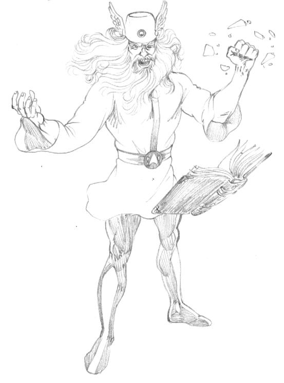
When he first appeared, Mordru was shown to be the baddest of the
bad. Almost unbeatable, we never even saw his first encounter with the
Legion of Superheroes! Our introduction to the white-haired wizard came when
he broke out of the prison the Legion had put him in, some time before. We
learned that Mordru had gone to the Sorcerer's World, Zerox, to study magic
and quickly rose to the level of master and teacher. During this time, he
caused Mysa Nal, of Naltor, to fail her final testing which led to her exile
from Zerox. At this point, Mordru stole the powers of the other masters and
made himself absolute ruler of Zerox.

The old-style Mordru always looked like he'd been designed as an
afterthought. Throw together a few wizard cliches and try to give it a bit
of a super-villain styling. Always hated it.
Of course, much of this is changed, due to the many upheavals in DC
Comics' history, so I won't waste time on it. In recent years, there have
been two incarnations of Mordru, first the Legion/Legionnaires version in
the 30th century, as envisioned by Jeff Moy.

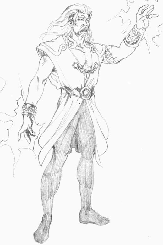
Moy's art fascinates me, but he does have one weakness. His villains
and monsters don't look very villainous or dangerous. His Mordru is no
exception. I like the basic look, but the figure is just way to young and
buff-looking.
More recently, Mordru has been used to excellent effect in the JSA
book. This is a younger, very ruthless, less powerful Mordru, who is
eventually revealed to be a Lord of Chaos, in humanoid form. Of course,
using him this way means he could be overused, the way Darkseid was in the
early 80s, and Vandal Savage was, in the mid/late 80s, or the way R'as Al
Ghul is being used, these days.

This is a good design. Has enough of that "wizardy" look to it, but
doesn't have the flowing robes and such that are so common is "wizard"
character designs.
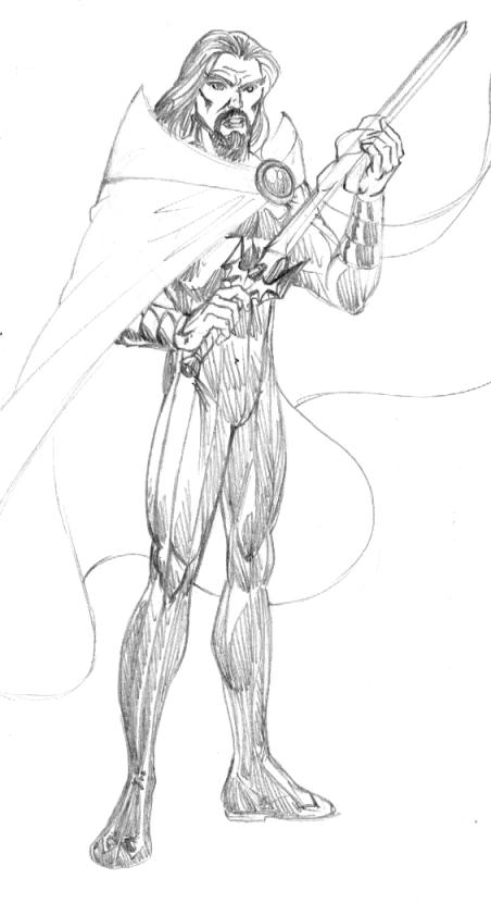
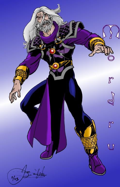
For my own design, I thought I'd stray from all the previous
designs, but going for a style that evokes medieval armor. I also went back
to the full beard, more for tradition, than anything else. Besides,
everybody's wearing my goatee, these days and I get zero credit for starting
this fashion!
I borrowed colors from just about every version of the character
that has existed.

Well, I'm off to Itza-Con, in the morning.
Back in a month!
|
